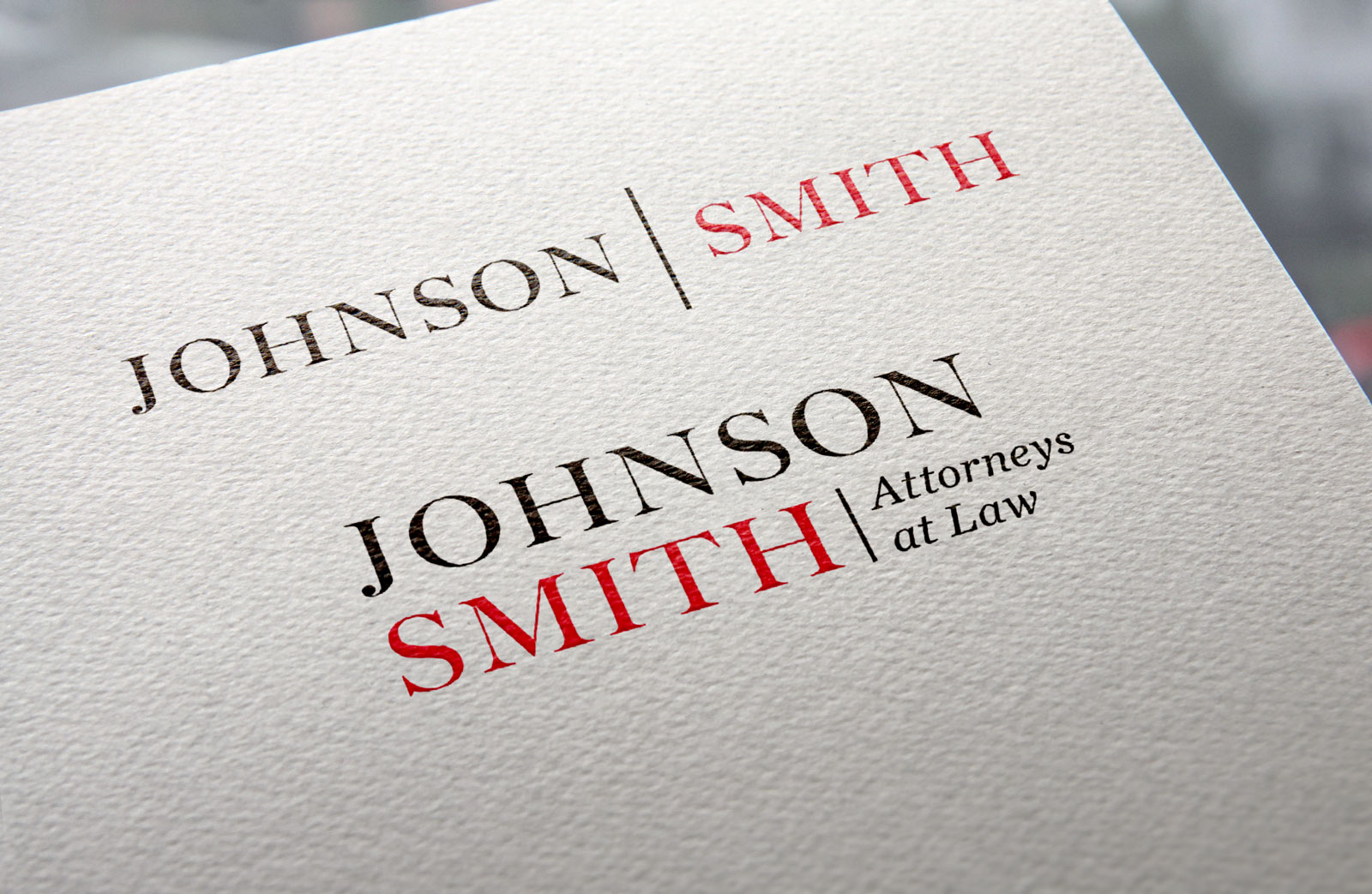
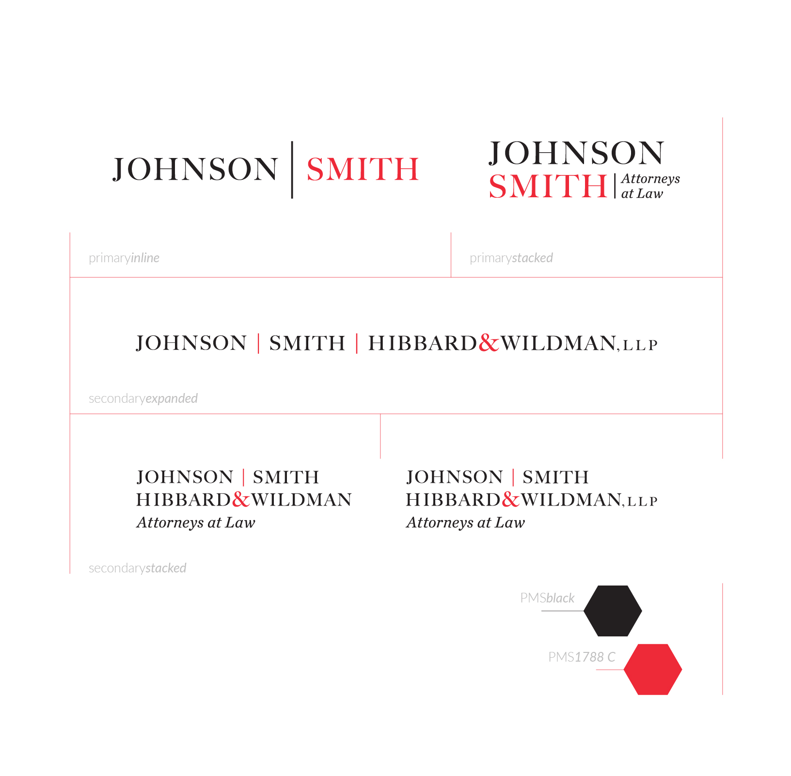
Johnson | Smith logo
Description
Spartanburg law firm, JSH&W or Johnson, Smith, Hibbard & Wildman, wanted to modernize their identity and signage. They wanted their mark to be clean, streamlined, and essentially formalize what their clients’ had called them for years—”Johnson/Smith.” They weren’t changing the name, nor the character of the firm. Their existing mark was the truncated “JSH&W.” It, literally, worked on paper but was awkward to say and presented issues in presenting verbally.
We took our cues from their existing mark. Using modest serif letterforms, we worked to bring each form into a more equal proportion. The red ampersand that was used as an accent in the old mark really felt like more of a hot-spot. We spread the red a bit to balance the presence. The ampersand is still used in the secondary wordmarks, but its size has come up to meet the rest of the type. The result is a clean, comfortable, modernized wordmark that will suit the lawfirm well for the foreseeable future.
Categories
- Branding


